03/04/17

|
|
03/04/17
|
|
|
|
|
|
|
|
|
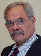
Howard Wainer is Distinguished Research Scientist for the National Board of Medical Examiners and Adjunct Professor of Statistics at the Wharton School of the University of Pennsylvania. Excerpt from American Scientist biography Biography as posted on Amazon: Dr. Wainer received his Ph. D. from Princeton University in 1968. After serving on the faculty of the University of Chicago, a period at the Bureau of Social Science Research during the Carter Administration, and 21 years as Principal Research Scientist in the Research Statistics Group at Educational Testing Service, he is now Distinguished Research Scientist at the National Board of Medical Examiners and Professor (adjunct) of Statistics at the Wharton School of the University of Pennsylvania. Dr. Wainer has a long-standing interest in the use of graphical methods for data analysis and communication, robust statistical methodology, and the development and application of generalizations of item response theory. His work on testlet response theory has combined all three. His latest books are Picturing the uncertain world (2009) and Uneducated Guesses (2011). Dr. Wainer was elected a Fellow in the American Statistical Association in 1985 and a Fellow of the American Educational Research Association in 2009. He was awarded the Educational Testing Service's Senior Scientist Award in 1990 and selected for the Lady Davis Prize and was named the Schonbrun Visiting Professor at the Hebrew University in 1992. He received the 2006 National Council on Measurement in Education Award for Scientific Contribution to a Field of Educational Measurement for his development of Testlet Response Theory and given NCME's career achievement award in 2007, and he received the Samuel J. Messick Award for Distinguished Scientific Contributions Award from Division 5 of the American Psychological Association in 2009 and was included in Who's Who in America, 2009 and 2010. He was on the editorial board of Psychological Methods and the editor of the Journal of Educational and Behavioral Statistics from 2002 until 2004 and is a former Associate Editor of the Journal of the American Statistical Association, and Applied Psychological Measurement as well as a former Treasurer of the Psychometric Society. Since 1990 he has written a popular column on data visualization in the statistics magazine Chance. Search content of Wainer book in Google books Medical Illuminations: Using Evidence, Visualization and Statistical Thinking to Improve Healthcare by Howard Wainer, 2013.
Lauded for their contributions to statistics, psychology, and psychometrics, the authors make statistical methods relevant to readers’ day-to-day lives by including real historical situations that demonstrate the role of statistics in reasoning and decision making. The historical vignettes encompass the English case of Sally Clark, breast cancer screening, risk and gambling, the Federal Rules of Evidence, "high-stakes" testing, regulatory issues in medicine, difficulties with observational studies, ethics in human experiments, health statistics, and much more. In addition to these topics, seven U.S. Supreme Court decisions reflect the influence of statistical and psychometric reasoning and interpretation/misinterpretation. Exploring the intersection of ethics and statistics, this comprehensive guide assists readers in becoming critical and ethical consumers and producers of statistical reasoning and analyses. It will help them reason correctly and use statistics in an ethical manner. A Statistical Guide for the Ethically Perplexed by Lawrence Hubert and Howard Wainer, 2012.
For disciplines concerned with human well-being, such as medicine, psychology, and law, statistics must be used in accordance with standards for ethical practice. A Statistical Guide for the Ethically Perplexed illustrates the proper use of probabilistic and statistical reasoning in the behavioral, social, and biomedical sciences. Designed to be consulted when learning formal statistical techniques, the text describes common instances of both correct and false statistical and probabilistic reasoning. Lauded for their contributions to statistics, psychology, and psychometrics, the authors make statistical methods relevant to readers’ day-to-day lives by including real historical situations that demonstrate the role of statistics in reasoning and decision making. The historical vignettes encompass the English case of Sally Clark, breast cancer screening, risk and gambling, the Federal Rules of Evidence, "high-stakes" testing, regulatory issues in medicine, difficulties with observational studies, ethics in human experiments, health statistics, and much more. In addition to these topics, seven U.S. Supreme Court decisions reflect the influence of statistical and psychometric reasoning and interpretation/misinterpretation. Exploring the intersection of ethics and statistics, this comprehensive guide assists readers in becoming critical and ethical consumers and producers of statistical reasoning and analyses. It will help them reason correctly and use statistics in an ethical manner. Uneducated Guesses: Using Evidence to Uncover Misguided Education Policies. Princeton Univ. Press, 2011.
Uneducated Guesses challenges everything our policymakers thought they knew about education and education reform, from how to close the achievement gap in public schools to admission standards for top universities. In this explosive book, Howard Wainer uses statistical evidence to show why some of the most widely held beliefs in education today--and the policies that have resulted--are wrong. He shows why colleges that make the SAT optional for applicants end up with underperforming students and inflated national rankings, and why the push to substitute achievement tests for aptitude tests makes no sense. Wainer challenges the thinking behind the enormous rise of advanced placement courses in high schools, and demonstrates why assessing teachers based on how well their students perform on tests--a central pillar of recent education reforms--is woefully misguided. He explains why college rankings are often lacking in hard evidence, why essay questions on tests disadvantage women, why the most grievous errors in education testing are not made by testing organizations--and much more. No one concerned about seeing our children achieve their full potential can afford to ignore this book. With forceful storytelling, wry insight, and a wealth of real-world examples, Uneducated Guesses exposes today's educational policies to the light of empirical evidence, and offers solutions for fairer and more viable future policies Reviews: "Uneducated Guesses is an insider's look at using test scores to make high stakes decisions in education. In this rigorous, refreshing rebuttal of conventional thinking, Wainer argues that in the world of education policy, we all would be better served by examining the evidence that demonstrates that our ideas will improve the systems we're trying to transform."--Dennis Van Roekel, president, National Education Association "With his usual verve, flair, and disdain for pious nonsense, Howard Wainer offers a refreshingly fact-based view of a complex problem: the use of tests in educational selection and evaluation. A must-read for anyone involved in these issues and a fun read for anyone who wishes to be educated and entertained at the same time."--Daniel Kahneman, Nobel Laureate in Economics, Princeton University "Howard Wainer's account of a selection of important scientific issues arising from educational testing is lucid, wise, and entertaining, and should be required reading for anyone interested in improving educational policy."--Stephen M. Stigler, University of Chicago "Uneducated Guesses is a must-read for enthusiasts of evidence-based decision making and for those who make public policy decisions without consulting the evidence. The former will be sobered by a real and random world that may not match their theoretical models. The latter will be surprised to learn from past research the power and limits of public policy decisions. Wainer lays it all out in engaging and accessible prose and numbers."--Arthur E. Wise, president emeritus, National Council for Accreditation of Teacher Education PICTURING THE UNCERTAIN WORLD: How to Understand, Communicate, and Control Uncertainty through Graphical Display (2009) In Google books
First sentence: "How much is enough?"
Book Description In his entertaining and informative book Graphic Discovery, Howard Wainer unlocked the power of graphical display to make complex problems clear. Now he's back with Picturing the Uncertain World, a book that explores how graphs can serve as maps to guide us when the information we have is ambiguous or incomplete. Using a visually diverse sampling of graphical display, from heartrending autobiographical displays of genocide in the Kovno ghetto to the "Pie Chart of Mystery" in a New Yorker cartoon, Wainer illustrates the many ways graphs can be used--and misused--as we try to make sense of an uncertain world. Picturing the Uncertain World takes readers on an extraordinary graphical adventure, revealing how the visual communication of data offers answers to vexing questions yet also highlights the measure of uncertainty in almost everything we do. Are cancer rates higher or lower in rural communities? How can you know how much money to sock away for retirement when you don't know when you'll die? And where exactly did nineteenth-century novelists get their ideas? These are some of the fascinating questions Wainer invites readers to consider. Along the way he traces the origins and development of graphical display, from William Playfair, who pioneered the use of graphs in the eighteenth century, to instances today where the public has been misled through poorly designed graphs. We live in a world full of uncertainty, yet it is within our grasp to take its measure. Read Picturing the Uncertain World and learn how. From the Back Cover "Feel like you're drowning in data? Howard Wainer is an enthusiastic advocate for graphs and statistics ability to clarify complexity. His essays illustrate how to exploit the possibilities—and avoid the pitfalls—in presenting information so that it is actually informative." —Joel Best, author of Stat-Spotting: A Field Guide to Identifying Dubious Data Wainer's book is a delight to read. Readers will come away with a clear understanding of how uncertainty, properly measured, can help us make decisions and can provide a skeptical aura about the facts behind those decisions. Wainer's examples show how statistical reasoning is needed to make sense of what our observations tell us. This book offers insights beyond what is usually taught in statistics courses." —David Salsburg, author of The Lady Tasting Tea: How Statistics Revolutionized Science in the twentieth Century "An entertaining and thought-provoking book. From displaying the Medicare drug benefit and trends in test scores and school spending, to unraveling Freedle's folly, Howard Wainer tells story after story about the understanding and display of variation." —Andrew Gelman, author of Red State, Blue State, Rich State, Poor State "This book offers lessons on the effective presentation of numbers and how to avoid common mistakes in interpreting statistical information. At a time when statisticians are in an arms race to develop ever more complex and impenetrable statistical formulations, Wainer teaches that the purpose of statistics is to make the complex simple. He is one of the few recognized authorities on the presentation of numerical evidence." —Gary M. Klass, author of Just Plain Data Analysis "it was a real joy to read Wainer's book. Its great strengths are the interesting examples, the insightful and instructive analysis, and the entertaining writing. There is much to be learned here, and Wainer does a superb job of bringing out the general principles. This is an important book. It clearly demonstrates the value of statistical thinking." -Karl W. Broman, University of Wisconsin-Madison Reviews: In Picturing the Uncertain World, Howard Wainer approaches this problem through stories, and every one is a gem. This is territory that has long been dominated by the books of Edward Tufte . . . but Wainer's approach is refreshingly different. He has himself been involved in many policy debates and understands well that the same information can be interpreted in a variety of ways to support widely divergent positions. . . . Like two of Wainer's earlier books . . . this one makes for very fine reading and would be an excellent text for a general-education seminar. -- Michael Goodchild, American Scientist As enjoyable to read as it is enlightening, [Picturing the Uncertain World] includes far more than its title indicates. Throughout, Wainer illuminates many of the big ideas of statistics in ways that help the reader understand and value the ideas. He provides contrasting graphical forms to demonstrate good data displays and incorporates analogies to help readers understand why certain logical arguments are flawed. . . . Anyone would enjoy reading this book. -- Mathematics Teacher TABLE OF CONTENTS CHAPTER 1 THE MOST DANGEROUS EQUATION In this chapter we nominate De Moivre's description of the expected variation in the arithmetic mean for the title of the most dangerous equation To support this conclusion we describe five separate examples where ignorance of this equation has led to enormous wastes of time, moneys and human resources. These five examples span almost a thousand years and areas as diverse as monetary policy education policy, medical practice, and the genetic basis of sex differences in intelligence II Political Issues In this section we show how five different kinds of issues that emerged from essentially political arguments could. be illuminated with more careful thought and a graph or two. In chapter 6, we introduce a very simple probabilistic model that yields surprising richness of understanding, which apparently escaped the editorial writers of the New York Times.
III Educational Testing In the four thousand years since its inception in ancient China, mental testing has promised to provide an important tool toward true meritocratic society. Replacing family connections with an individual's ability as the key to opening the doors to economic and social success remains a principal goal for modern societies. Progress toward this goal has been impressive, but it has occurred in fits and starts. In this section we examine three proposals to aid in using test scores toward making this a more just society. The first uses a statistical method commonly employed in other circumstances to solve a vexing problem. In chapter 8 we examine a well meaning but, at its heart, flawed scheme aimed at reducing intergroup differences. And finally, in chapter 9, we look at a recent court case involving test scoring and show that the defense's case was based on a misunderstanding of the meaning of uncertainty.
IV. Mostly Methodological This section is a bit more technical than the others, focusing more explicitly on the statistical too with its application being secondary. In chapter 10 we look at the validity of linear extrapolation through unexpectedly consistent improvements in the world record for men running a mile that have occurred over the course of the twentieth century and speculate whether it shou1d have been predicable, and what, if anything, it means about future improvements in the twenty-first century. The eleventh chapter looks at statistical graphics in the popular media. Chapter 12 demonstrates how a mixture of statistical tools, statistical thinking, and various graphic forms combine to provide us with a guided pathway of discovery. The last two chapters are perhaps the most narrowly focused of all, looking first at ways to show our uncertainty graphically and next at one way in which powerful computing when combined with our desire for simplicity at all costs can be used to mislead us.
V. HISTORY We understand these best those things we see grow from their very beginnings -- Aristotle, Metaphysics. The Science of Uncertainty has been under development for a long time. In this section, I pay homage to our forebears by using modern tools to investigate ancient puzzles (chapters 15 and 16), by exploring the origins of some of these modern tools (Chapter 17 and 18), by defending the wisdom of the ancients from contemporary misuses (chapter 18), by communicating the wisdom of a modern master (chapter 2O), and finally to by a heart-rendering use of graphics to paint an evocative picture of one part of what was perhaps the greatest horror in alt. human history.
Graphic Discovery: A Trout in the Milk and Other Visual Adventures (2004) In Google books
First sentence: "Getting information from a table is like extracting sunbeams from a cucumber" (Farquhar and Farquhar). Book Description Good graphs make complex problems clear. From the weather forecast to the Dow Jones average, graphs are so ubiquitous today that it is hard to imagine a world without them. Yet they are a modern invention. This book is the first to comprehensively plot humankind's fascinating efforts to visualize data, from a key seventeenth-century precursor--England's plague-driven initiative to register vital statistics--right up to the latest advances. In a highly readable, richly illustrated story of invention and inventor that mixes science and politics, intrigue and scandal, revolution and shopping, Howard Wainer validates Thoreau's observation that circumstantial evidence can be quite convincing, as when you find a trout in the milk. The story really begins with the eighteenth-century origins of the art, logic, and methods of data display, which emerged, full-grown, in William Playfair's landmark 1786 trade atlas of England and Wales. The remarkable Scot singlehandedly popularized the atheoretical plotting of data to reveal suggestive patterns--an achievement that foretold the graphic explosion of the nineteenth century, with atlases published across the observational sciences as the language of science moved from words to pictures. Next come succinct chapters illustrating the uses and abuses of this marvelous invention more recently, from a murder trial in Connecticut to the Vietnam War's effect on college admissions. Finally Wainer examines the great twentieth-century polymath John Wilder Tukey's vision of future graphic displays and the resultant methods--methods poised to help us make sense of the torrent of data in our information-laden world. From the Inside Flap "The use of charts and graphs to make numbers both intelligible and memorable is a surprisingly modern idea. How this idea grew from a curiosity into a basic tool of modern science is a story of remarkable men and curious paradoxes, a story that Howard Wainer tells with zest and sympathetic understanding. Informative, readable, profoundly engaging."--George A. Miller, Princeton University, author of The Magical Number Seven, Plus or Minus Two "I liked this book very much indeed. It will be very useful to the many who are interested in the interplay of forces that have yielded modern science."--Eric T. Bradlow, Wharton School of the University of Pennsylvania "Fascinating. This book . . . the first to explore the chronological development of graphical data display . . . should be required reading for statisticians, applied researchers, scientists, and certainly for all journalists."--I. Elaine Allen, Babson College "A delightful and thought-provoking book on statistical graphics. Wainer provides compact case studies of how graphical presentations such as bar charts, plots, and scattergrams can lead to important discoveries. The most compelling examples show how a published graphic could be dramatically improved to avoid misleading interpretations or make new discoveries. The most entertaining parts are his vignettes of historical figures, such as his twin heroes of William Playfair and John Tukey. I enjoyed Wainer's sardonic wit, personal anecdotes, and popular culture references, but the real gift was the clarity of thinking and the wise guidance about deep issues in statistics, data mining, and information visualization."--Ben Shneiderman, College Park, MD Reviews: The Economist : [A] personalized and readable jaunt through the history of charting. Choice : Well written and innovative. . . . Fascinating with its wide view. Raymond N. Greenwell MAA Online : [An] entertaining, informative, and persuasive book on graphs. . . . Sometimes a well-designed graph tells a very convincing story. Malcolm James Ree Personnel Psychology : This book . . . is a remarkable value that every practitioner of statistics can afford. George A. Miller, Princeton University, author of "The Magical Number Seven, Plus or Minus Two" : The use of charts and graphs to make numbers both intelligible and memorable is a surprisingly modern idea. How this idea grew from a curiosity into a basic tool of modern science is a story of remarkable men and curious paradoxes, a story that Howard Wainer tells with zest and sympathetic understanding. Informative, readable, profoundly engaging. Eric T. Bradlow, Wharton School of the University of Pennsylvania : I liked this book very much indeed. It will be very useful to the many who are interested in the interplay of forces that have yielded modern science. I. Elaine Allen, Babson College : Fascinating. This book . . . the first to explore the chronological development of graphical data display . . . should be required reading for statisticians, applied researchers, scientists, and certainly for all journalists. Ben Shneiderman, College Park, MD : A delightful and thought-provoking book on statistical graphics. Wainer provides compact case studies of how graphical presentations such as bar charts, plots, and scattergrams can lead to important discoveries. The most compelling examples show how a published graphic could be dramatically improved to avoid misleading interpretations or make new discoveries. The most entertaining parts are his vignettes of historical figures, such as his twin heroes of William Playfair and John Tukey. I enjoyed Wainer's sardonic wit, personal anecdotes, and popular culture references, but the real gift was the clarity of thinking and the wise guidance about deep issues in statistics, data mining, and information visualization. Visual Revelations: Graphical Tales of Fate and Deception From Napoleon Bonaparte To Ross Perot
LEA, Inc. (July 1, 2000) Hardcover: 192 pages. In Google books Book Description: To function in modern society complex data must be absorbed and understood at a breakneck pace. The most efficient way to do this is through data-based graphics. This book is an exploration and celebration of graphical methods of data presentation. Visual Revelations' principal purpose is to enlighten, inform, and amuse the reader regarding the shortcomings of common graphical practices; particularly how they can misinform while simultaneously providing models of wonderful graphics. There are many examples of the best graphic practice, graphs that go beyond conveying, facts, and structure to be able to carry emotion as well. Aimed at an educated, lay audience, this volume benefits anyone who must either convey or receive quantitative information, including designers, statisticians, and people in the media. Card catalog description: This book takes the reader on an eye-opening tour of the methods and history of presenting data by visual means, showing the reader how to be both a better producer and consumer of graphics. Visual Revelations sheds light on how well-done graphic representations illuminate subtle and significant elements of the information they represent, how poorly conceived graphical devices can misrepresent and distort facts and data, and how cleverly designed displays can be potent tools for manipulating the viewer's perception and opinion. --This text refers to an out of print or unavailable edition of this title Psychometrika: "Wainer's books are simply the most entertaining, engaging, and thought-provoking books in this area." New Scientist, September 13, 1997: Hate pie charts? Then grab Howard Wainer's Visual Revelations...It's a readable and highly informative guide on how to add elegance, grace and impact to idea presentation. ...His examples are fascinating... --This text refers to an out of print or unavailable edition of this title. The American Statistician Articles: Ian Spence and and Howard Wainer (2005). William Playfair and His Graphical Inventions: An Excerpt From the Introduction to the Republication of His Atlas and Statistical Breviary. The American Statistician Volume 59, Issue 3, p 224-229. DOI: 10.1198/000313005X54216. Wainer, H. and Lisa M. Brown (2004). Two Statistical Paradoxes in the Interpretation of Group Differences Illustrated with Medical School Admission and Licensing Data. The American Statistician, Vol 58, Issue 2. Pages 117-123. DOI: 110.1198/0003130043268. See also Letter to the Editor by Lesser in the American Statistician, Vol 58, Issue 4, pp 362. Howard Wainer (1996). Depicting Error. The American Statistician Volume 50, Issue 2, pp. 101-111. DOI: 10.1080/00031305.1996.10474355. David Thissen & Howard Wainer (1986). XTREE: A Multivariate Graphical Icon Applicable in the Evaluation of Statistical Estimators. The American Statistician Volume 40, Issue 2, pp 149-153. DOI: 10.1080/00031305.1986.10475381. Howard Wainer (1984). How to Display Data Badly. The American Statistician Volume 38, Issue 2, pp. 137-147. DOI: 10.1080/00031305.1984.10483186. Howard Wainer (1983). Pyramid Power: Searching for an Error in Test Scoring with 830,000 Helpers. The American Statistician Volume 37, Issue 1, pp 87-91. DOI: 10.1080/00031305.1983.10483095. Howard Wainer & Carl M. Francolini (1980). An Empirical Inquiry concerning Human Understanding of Two-Variable Color Maps. The American Statistician Volume 34, Issue 2, pp 81-93. DOI: 10.1080/00031305.1980.10483006. Howard Wainer (1974). The Suspended Rootogram and other Visual Displays: An Empirical Validation. The American Statistician Volume 28, Issue 4, pp. 143-145. DOI: 10.1080/00031305.1974.10479098. The American Scientist Articles: Wainer, H. and
S. Lysen (2009).
That's
Funny The American Scientist, July-Aug 2009 Vol 97, N 4, P 272.
DOI: 10.1511/2009.79.272 Other Articles: 2009: Can we ever prevent the imprisonment of innocent people? "so long as only a very small minority of people commit crimes and the criminal justice system is fair ("fair" meaning that all people are equally subject to investigation) there will always be a very large proportion of innocent people convicted." 2004: Three Paradoxes in the Interpretation of Group Differences: Illustrated with Medical School Admission and Licensing Data by Howard Wainer National Board of Medical Examiners And Lisa M. Brown American Board of Internal Medicine. Draft of Paper for The American Statistician 2004. "Interpreting group differences observed in aggregated data is a practice that must be done with enormous care. Often the truth underlying such data is quite different than a naïve first look would indicate. The confusions that can arise are so perplexing that some of the more frequently occurring ones have been dubbed paradoxes. In this paper we describe three of the best known of these paradoxes --Simpson’s Paradox, Kelley’s Paradox, and Lord’s Paradox -- and illustrate them in a single data set." VISUAL REVELATIONS in CHANCE MAGAZINE (Index). Look in Chance index for PDFs. Chance 2/05/2013: Stigler’s Law of Eponymy and Marey’s Train Schedule. "Stigler’s law: No scientific discovery is named after its original discoverer" Chance 11/27/2012: Waiting for Achilles "focusing on the [black-white] difference blinds us to ... a remarkable success in education" Chance 9/12/2012: Cheating: Some Ways to Detect It Badly. "Was There Copying on a Licensing Exam?" Chance 4/17/2012: When Nothing Is Not Zero: A true saga of missing data, adequate yearly progress, and a Memphis charter school. Chance 2/01/2012: Moral Statistics and the Thematic Maps of Joseph Fletcher. Chance 11/21/2011: A Remarkable Horse: An Inquiry into the Accuracy of Medical Predictions by Wainer and Hubert. "when we look at statistical reasoning applied by psychiatrists, we find mysteries." Chance 9/01/2011: How Much Is Tenure Worth? "I will focus on the possible effect of the removal of job tenure on education budgets." Chance 5/01/2011: The First Step Toward Wisdom. "some of the blame for these untoward outbreaks [toward inanimate objects] can be given to the remarkable dopiness that substitutes for wisdom in modern society." Chance 2010 23(4): Pies, Spies, Roses, Lines, and Symmetries. Comparing different ways of displaying accident rates by age and gender. Chance 2010 23(3): Inside Out Plots by Jim Ramsay and Howard Wainer. "Statistical problems with just one independent variable and a single dependent variable are usually only found in textbooks. The real world is hopelessly multivariate. " Chance 2010 23(1): Schrödinger's Cat and the Conception of Probability in Item Response Theory. Percentage of successes within a given subject under varying conditions versus percentage of successes for different conditions where different subjects each under a single conditions. Chance 2009 22(4): A Good Table Can Beat a Bad Graph: It Matters Who Plays Mozart. "a table prepared with a little thought can beat a badly conceived graph—even if that graph took up a whole page of the Sunday New York Times." Chance 2009: 22(3): A Little Ignorance: How Statistics Rescued a Damsel in Distress. Peter Baldwin and Howard Wainer. "our interest in the cause is limited to showing it is plausible that the aide's behavior [improper helping] had no effect on children's scores" Chance 2009 22(2): Pictures at an Exhibition. Howard Wainer and Mike Larsen. "There are many ways to display even a relatively small data set. Myriad choices are required to produce a graph that accomplishes the three aims of having a purpose, answering a question or questions, and being memorable. Scale, visual metaphor including plotting symbols, the order of the data in one or more dimensions, and the directions to the reader are important. Chance 2009 22(1): A Centenary Celebration for Will Burtin: A Pioneer of Scientific Visualization. Chance 2008 21(4): Looking at Blood Sugar Howard Wainer and Paul Velleman. "We suggest that the use of average blood sugar has flaws that are easily ameliorated through the use of resistant/robust methods." Chance 2008 21(3): Giving the Finger to Dating Services. By Grace Lee, Paul Velleman, and Howard Wainer. Chance 2008 21(2): Improving Graphic Displays by Controlling Creativity. "When trying to prepare a coherent report on a single, possibly broad, topic, the displays should also be coherent. Repeating the same format with different data eases the decoding task of the viewer." Chance 2008 21(1): Until Proven
Guilty: False Positives and the War on Terror (PDF). Chance 2007 20(2): Galton's Normal Is Too Platykurtic (PDF). Chance 2007 20(1): Insignificant Is Not Zero: Rescoring the SAT as an Example (PDF) Chance 2006 19(2): Using Graphs to Make the Complex Simple: The Medicare Drug Plan as an Example (PDF) Chance 2006 19(1): Finding What Is Not There Through the Unfortunate Binning of Results: The Mendel Effect (PDF) Chance 2005 18(4): Truth Is Slower Than Fiction: Francis Galton as an Illustration (PDF) Chance 2005 18(3): Old Mother Hubbard and the United Nations: An Adventure in Exploratory Data Analysis (PDF) Chance 2005 18(2): Stumbling on the Path Toward the Visual Communication of Complexity (PDF) Chance 2004 17(4): Curbstoning IQ and the 2000 Presidential Election (PDF) Chance 2004 17(2): When Form Violates Function (PDF) Chance 2004 17(1): Numbers and the Remembrance of Things Past (PDF) Chance 2003 16(4): A Political Statistic (PDF) Chance 2003 16(3): Diffusion de Quelques Idees: A Master's Voice (PDF) Chance 2003 16(2): How Long Is Short? (PDF) Chance 2003 16(1): A Graphical Legacy of Charles Joseph Minard: Two Jewels from the Past (PDF) Chance 2002 15(4): A Small Hurrah for the Black Death (PDF) Chance 2002 15(3): The BK-Plot: Making Simpsons' Paradox Clear to the Masses (PDF) Copy Chance 2002 15(2): Reporting Test Results to Institutions and Nations (PDF) Chance 2002 15(1): Clear Thinking Made Visible: Redesigning Score Reports for Students (PDF)
OTHER ARTICLES: A heavy bank of figures is grievously wearisome to the eye, and the popular mind is as incapable of drawing any useful lessons from it as of extracting sunbeams from cucumbers. —Arthur Briggs Farquhar and Henry Farquhar, 1891 Instead, a graphical approach was developed and given a jump start by the Scot William Playfair (1756–1823) in his 1786 Commercial and Political Atlas. Playfair’s methods were picked up broadly, and by the 19th century there was a huge proliferation of scientific atlases, filled with pictures, that were so laconic that the words almost disappeared entirely. The graphical movement had a simple idea—it supported the atheoretical plotting of data points which were then searched for suggestive patterns. This largely empirical approach reached a full consilience in 1977 with the publication of John Tukey’s influential Exploratory Data Analysis. And yet despite the warning of the brothers Farquhar, and the evidence of more than a century of scientific investigation, the table remains by far the principal means of communicating scientific evidence. In the figure at right is a summary of the kinds of graphic forms used in the Journal of the American Medical Association in 2008. A similar picture would describe all of the other journals we have looked at. This tabular approach is a mistake. There is much that is being missed that might otherwise be found." 2008: Why Is a Raven Like a Writing Desk? Musing on the power of convention by Howard Wainer. American Scientist November-December 2008 Volume 96, Number 6 Page: 446. 2007: The Most Dangerous Equation Ignorance of how sample size affects statistical variation has created havoc for nearly a millennium. American Scientist May-June 2007. Volume 95, Number 3 Page: 249 2001: Talk at Colorado State "Exploratory Data Analysis Whither & Whence: A Personal Journey" by Howard Wainer. Wainer, H. 1984. How to display data badly. The American Statistician 38:137-47. Wainer, H. 1983. Multivariate displays. In Recent advances in statistics, ed. M. H. Rizvi, J. Rustagi, and D. Siegmund, 469-508. New York: Academic Press. |
|
This site was last updated 08/16/16
 For
disciplines concerned with human well-being, such as medicine, psychology,
and law, statistics must be used in accordance with standards for ethical
practice. A Statistical Guide for the Ethically Perplexed illustrates
the proper use of probabilistic and statistical reasoning in the behavioral,
social, and biomedical sciences. Designed to be consulted when learning
formal statistical techniques, the text describes common instances of both
correct and false statistical and probabilistic reasoning.
For
disciplines concerned with human well-being, such as medicine, psychology,
and law, statistics must be used in accordance with standards for ethical
practice. A Statistical Guide for the Ethically Perplexed illustrates
the proper use of probabilistic and statistical reasoning in the behavioral,
social, and biomedical sciences. Designed to be consulted when learning
formal statistical techniques, the text describes common instances of both
correct and false statistical and probabilistic reasoning.